Has Life Gotten Better?
Human civilization is thousands of years old. What's our report card? Whatever we've been doing, has it been "working" to make our lives better than they were before? Or is all our "progress" just helping us be nastier to others and ourselves, such that we need a radical re-envisioning of how the world works?
I'm surprised you've read this far instead of clicking away (thank you). You're probably feeling bored: you've heard the answer (Yes, life is getting better) a zillion times, supported with data from books like Enlightenment Now and websites like Our World in Data and articles like this one and this one.
I'm unsatisfied with this answer, and the reason comes down to the x-axis. Look at any of those sources, and you'll see some charts starting in 1800, many in 1950, some in the 1990s ... and only very few before 1700.1
This is fine for some purposes: as a retort to alarmism about the world falling apart, perhaps as a defense of the specifically post-Enlightenment period. (And I agree that recent trends are positive.) But I like to take a very long view of our history and future, and I want to know what the trend has been the whole way.
In particular, I'd like to know whether improvement is a very deep, robust pattern - perhaps because life fundamentally tends to get better as our species accumulates ideas, knowledge and abilities - or a potentially unstable fact about the weird, short-lived time we inhabit.
So I'm going to put out several posts trying to answer: what would a chart of "average quality of life for an inhabitant of Earth look like, if we started it all the way back at the dawn of humanity?"
This is a tough and frustrating question to research, because the vast majority of reliable data collection is recent - one needs to do a lot of guesswork about the more distant past. (And I haven't found any comprehensive study or expert consensus on trends in overall quality of life over the long run.) But I've tried to take a good crack at it - to find the data that is relatively straightforward to find, understand its limitations, and form a best-guess bottom line.
In future pieces, I'll go into detail about what I was able to find and what my bottom lines are. But if you just want my high-level, rough take in one chart, here's a chart I made of my subjective guess at average quality of life for humans2 vs. time, from 3 million years ago to today:
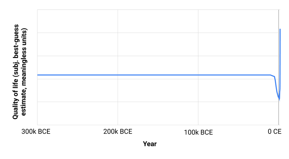
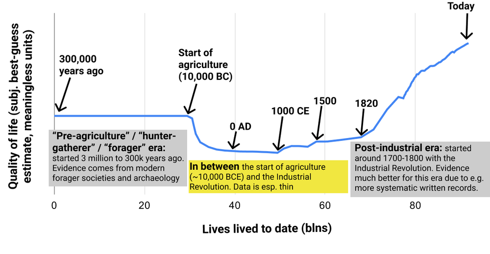
Sorry, that wasn't very helpful, because the pre-agriculture period (which we know almost nothing about) was so much longer than everything else.3
(I think it's mildly reality-warping for readers to only ever see charts that are perfectly set up to look sensible and readable. It's good to occasionally see the busted first cut of a chart, which often reveals something interesting in its own right.)
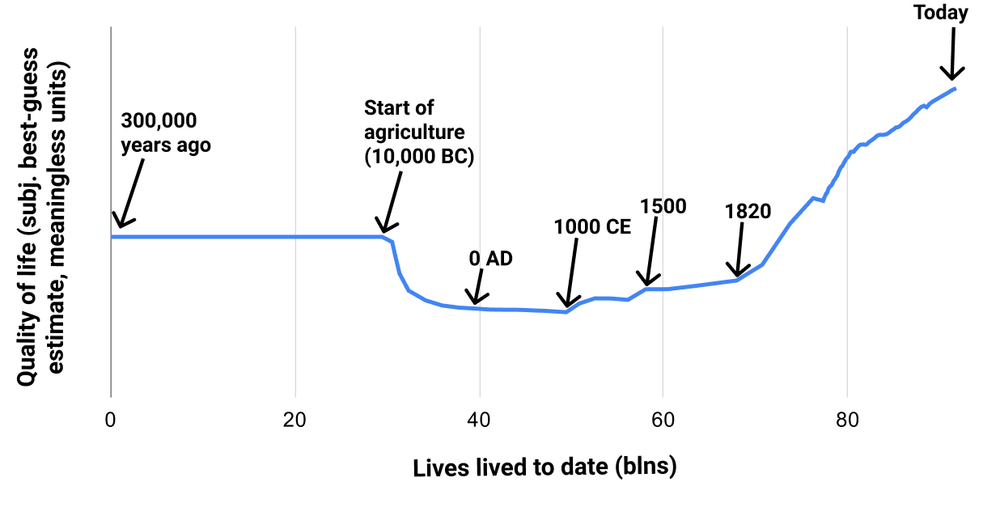
But here's a chart with cumulative population instead of year on the x-axis. The population has exploded over the last few hundred years, so this chart has most of the action going on over the last few hundred years. You can think of this chart as "If we lined up all the people who have ever lived in chronological order, how does their average quality of life change as we pan the camera from the early ones to the later ones?"
In other words:
- We don't know much at all about life in the pre-agriculture era. Populations were pretty small, and there likely wasn't much in the way of technological advancement, which might (or might not) mean that different chronological periods weren't super different from each other.5
- My impression is that life got noticeably worse with the start of agriculture some thousands of years ago, although I'm certainly not confident in this.
- It's very unclear what happened in between the Neolithic Revolution (start of agriculture) and Industrial Revolution a couple hundred years ago.
- Life got rapidly better following the Industrial Revolution, and is currently at its high point - better than the pre-agriculture days.
So what?
- I agree with most of the implications of the "life has gotten better" meme, but not all of them.
- I agree that people are too quick to wring their hands about things going downhill. I agree that there is no past paradise (what one might call an "Eden") that we could get back to if only we could unwind modernity.
- But I think "life has gotten better" is mostly an observation about a particular period of time: a few hundred years during which increasing numbers of people have gone from close-to-subsistence incomes to having basic needs (such as nutrition) comfortably covered.
- I think some people get carried away with this trend and think things like "We know based on a long, robust history that science, technology and general empowerment make life better; we can be confident that continuing these kinds of 'progress' will continue to pay off." And that doesn't seem quite right.
- There are some big open questions here. If there were more systematic examination of things like gender relations, slavery, happiness, mental health, etc. in the distant past, I could imagine it changing my mind in multiple ways. These could include:
- Learning that the pre-agriculture era was worse than I think, and so the upward trend in quality of life really has been smooth and consistent.
- Or learning that the pre-agriculture era really was a sort of paradise, and that we should be trying harder to "undo technological advancement" and recreate its key properties.
- As mentioned previously, better data on how prevalent slavery was at different points in time - and/or on how institutionalized discrimination evolved - could be very informative about ups and/or downs in quality of life over the long run.
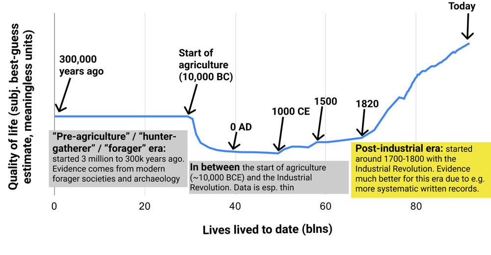
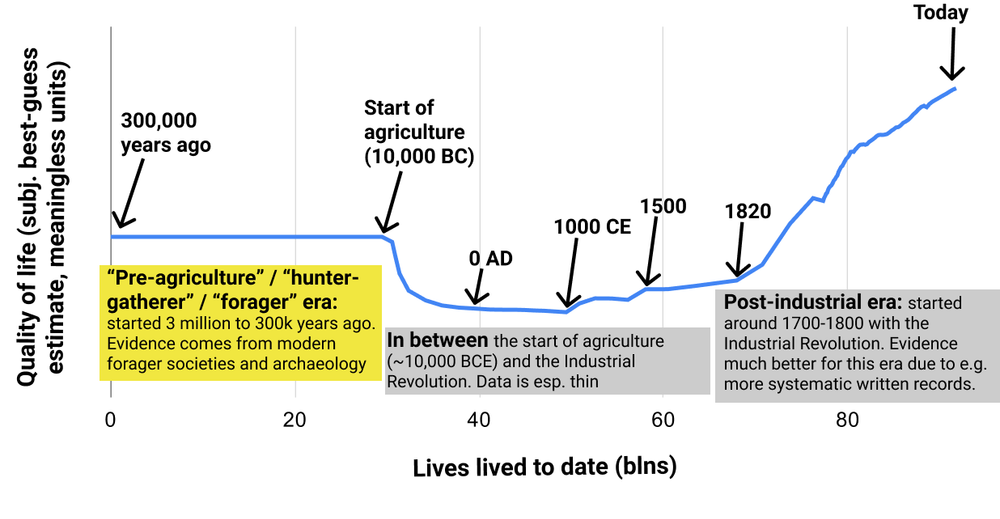
Here is the full list of posts for this series. I highlight different sections of the above chart to make clear which time period I'm talking about for each set of posts.
Post-industrial era
Has Life Gotten Better?: the post-industrial era introduces my basic approach to asking the question "Has life gotten better?" and apply it to the easiest-to-assess period: the industrial era of the last few hundred years.
Pre-agriculture (or "hunter-gatherer" or "forager") era
Pre-agriculture gender relations seem bad examines the question of whether the pre-agriculture era was an "Eden" of egalitarian gender relations. I like mysterious titles, so you will have to read the full post to find out the answer.
Was life better in hunter-gatherer times? attempts to compare overall quality of life in the modern vs. pre-agriculture world. Also see the short followup, Hunter-gatherer happiness.
In-between period
Did life get better during the pre-industrial era? (Ehhhh) compares pre-agriculture to post-agriculture quality of life, and summarizes the little we can say about how things changed between ~10,000 BC and ~1700 CE.
Supplemental posts on violence
Some of the most difficult data to make sense of throughout writing this series has been the data on violent death rates. The following two posts go through how I've come to the interpretation I have on that data.
Unraveling the evidence about violence among very early humans examines claims about violent death rates very early in human history, from Better Angels of Our Nature and some of its critics. As of now, I believe that early societies were violent by today's standards, but that violent death rates likely went up before they went down.
Falling everyday violence, bigger wars and atrocities: how do they net out? looks at trends in violent death rates over the last several centuries. When we include large-scale atrocities, it's pretty unclear whether there is a robust trend toward lower violence over this period.
Finally, an important caveat to the above charts. Unfortunately, the chart for average animal quality of life probably looks very different from the human one; for example, the rise of factory farming in the 20th and 21st centuries is a massive negative development. This makes the overall aggregate situation for sentient beings hard enough to judge that I have left it out of some of the very high-level summaries, such as the charts above. It is an additional complicating factor for the story that life has gotten better, as I'll be mentioning throughout this series.
Next in series: Has Life Gotten Better?: the post-industrial era
Thanks to Luke Muehlhauser, Max Roser and Carl Shulman for comments on a draft.
Use "Feedback" if you have comments/suggestions you want me to see, or if you're up for giving some quick feedback about this post (which I greatly appreciate!) Use "Forum" if you want to discuss this post publicly on the Effective Altruism Forum.
Footnotes
-
For example:
- I wrote down the start date of every figure in Enlightenment Now, Part II (which is where it makes the case that the world has gotten better), excluding one that was taken from XKCD. 6 of the 73 figures start before 1700; the only one that starts before 1300 is Figure 18, Gross World Product (the size of the world economy). This isn't a criticism - that book is specifically about the world since the Enlightenment, a few hundred years ago - but it's an illustration of how one could get a skewed picture if not keeping that in mind.
- I went through Our World in Data noting down every major data presentation that seems relevant for quality of life (leaving out those that seem relatively redundant with others, so I wasn't as comprehensive as for Enlightenment Now.) I found 6 indicators with data before 1300 (child/infant mortality, which looks flat before 1700; human height, which looks flat before 1700; GDP per capita, which rose slightly before 1700; manuscript production, which rose starting around 1100; the price of light, which seems like it fell a bit between 1300-1500 and then had no clear trend before a steep drop after 1800; deaths from military conflicts in England, which look flat before 1700; deaths from violence, which appear to have declined - more on this in a future piece) and 8 more with data before 1700. Needless to say, there are many charts from later on.
-
See the end of the post for a comment on animals. ↩
-
"Why didn't you use a logarithmic axis?" Well, would the x-axis be "years since civilization began" or "years before today?" The former wouldn't look any different, and the latter bakes in the assumption that today is special (and that version looks pretty similar to the next chart anyway, because today is special). ↩
-
I mostly used world per-capita income, logged; this was a pretty good first cut that matches my intuitions from summarizing history. (One of my major findings from that project was that "most things about the world are doing the same thing at the same time.") But I gave the pre-agriculture era a "bonus" to account for my sense that it had higher quality of life than the immediately post-agriculture era: I estimated the % of the population that was "nomadic/egalitarian" (a lifestyle that I think was more common at that time, and had advantages) as 75% prior to the agricultural revolution, and counted that as an effective 4x multiple on per-capita income. This was somewhat arbitrary, but I wanted to make sure it was still solidly below today's quality of life, because that is my view (as I'll argue).
The original version of this chart started 3 million years ago, rather than 300,000. I had waffled on whether to go with 3 million or 300,000 and my decision had been fairly arbitrary. I later discovered that I had an error in my calculations that caused me to underestimate the population over any given period, but especially longer periods such as the initial period. With the error corrected, the "since 3 million years ago" chart would've been more dominated by the initial period (something I especially didn't like because I'm least confident in my population figures over that period), so I switched over to the "300,000 years ago" chart. ↩
-
More specifically, I'd guess there was probably about as much variation across space as across time during that period. It's common in academic literature (which I'll get to in future posts) to assume that today's foraging societies are representative of all of human history before agriculture. ↩